Tom has a sunny disposition. Always cheerful, open, and frank. He’s easy to talk to, and always has an array of puns at the ready. Tom sells solar panels, and installs them. He gives you advice, calculates efficiency and subsidies, and attaches the panels to your roof. That’s why Tom asked me to create a sunny logo and brand when he started his business in these panels.
No green!
In his first brief, Tom gave me a nice challenge: avoid green! Lots and lots of his competitors use green in their brands. That’s not weird; solar energy is ecological and environmentally friendly. Green, in a word. Tom wanted to stand out from the masses with different colours. But… which ones?
Our first ideas were to use yellow and blue. Those two mix to create green. It’s that concept that I took to the drawing board.
![]()
Logo first
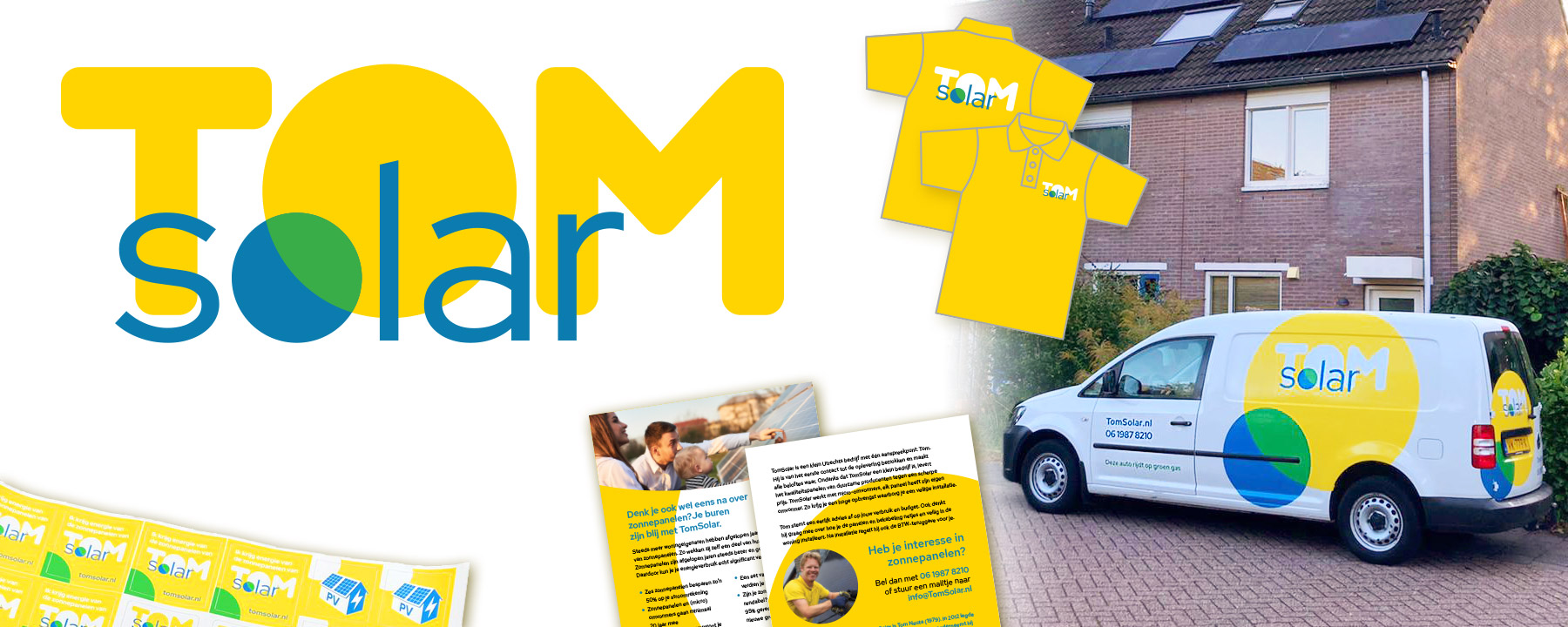
This logo was the result. The two ‘O’s in the logo partially overlap. One is the sun, the other the Earth. The sun shines her light on Earth and makes it green. A tiny bit of green, still. Because harsh yellow and blue can give off a very cheap look, I used warm tints for both colours.
I love adding small, funny details to my work. The font for ‘solar’ is called RedHat, referring the primary colour that’s missing. Also, RedHat’s lowercase ‘L’ has a tilted top, with a 13 degree angle. It turns out that this is angle is significant: it is the angle solar panels are installed at on a flat roof in the Netherlands. This allows them to catch the most light.
Sunny branding
The logo was just the beginning. Up till now, we added branding to a polo shirt, stickers, a flyer, letterhead, and decals on Tom’s car. Applying decals by hand was a nice challenge!
Yellow and white are dominant colours. Light, energetic, cheerful. A sunny brand for a sunny businessman. Are you thinking of having solar panels installed? Have Tom shine a light in your darkness!
Do you want a sunny, energetic brand? Get in touch and I’ll happily help you out!