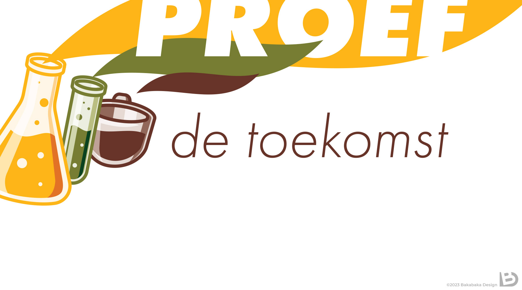
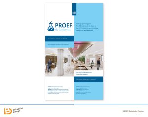
How will you do your work in the Future? What will you eat and drink at the office, and how does your office facilitate that? How will you meet with your colleagues in the future? ‘Proef de toekomst’ wanted to answer all these questions: it was an event in a large Dutch Government office. Together with Juul and Ellen of Gode Geel, I created a logo for this office event.
Wordplay
The event’s name is a wordplay on the fact that ‘experiment’ and ‘taste’ are homonyms in Dutch. So it both means ‘taste the future’ and ‘experiment: the future’.
Blame my chemistry background, but ‘experiment’ makes me think test tubes and flasks filled with liquids. There was an important liquid at the event: coffee. There was quite some focus on the ‘coffee corner of the future’, so Juul and Ellen insisted the logo have a reference to coffee.
As taste and smell are closely intertwined, I chose to represent taste with the coloured vapour plumes. The plume shape is prominent in the banner design. Funny detail: I used a font called Futura for the text.
On brand
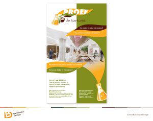
When we started the project, I asked Ellen and Juul explicitly about how on-brand the Government wanted us to be. Turned out that we had some freedom, but ‘don’t make it too wild’ was their advice. I decided to stay close to the prescribed Government branding. All my colours were derived from there, as was the rough lay-out of the banner.
It was with much pride that I presented the results to Code Geel. They were happy, so was I, and their client at the Government was on board as well.
Until some ten days later. It turned out there had been an internal miscommunication at the Government: we should not have gotten this free a rein in the design. The result was way, way too off-brand.
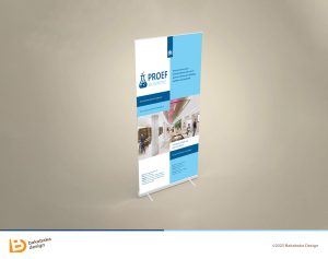
New attempt
Like three Speedys Gonzalez, we created a new version. Lots more low key, and way less daring. We wanted to be absolutely sure that this version was approved right off the bat. Fortunately, it was.
Of course it’s a huge pity to see a lot of work go ‘down the drain’ like this. But losing hope is not helping: we need a new, passable, version as quickly as possible. I really appreciated that the Code Geel people were very pragmatic in this. They were a joy to work with!
Need a logo for an office event?
Do you need a logo for your event? Office or other, I’d love to work with you. Even if, at some point, we need to start from scratch. Have a look at the other logo’s and print in my portfolio to get inspired.