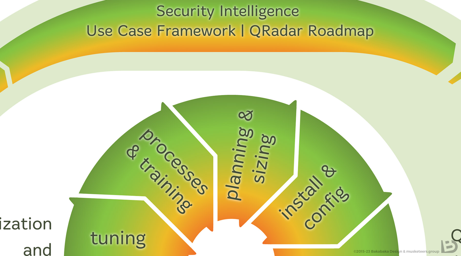
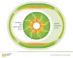
Do you know that feeling, that you can’t wait to improve on someting you see? You fingers almost itching to get started? I had that when I visited musketeers.group to be briefed about the design for their logo. On a whiteboard across the room hung a print of a schematic, obviously created in PowerPoint. I pointed at it, and boasted ‘I can do better than that’. Erik and Tom didn’t hesitate long to let me prove that: I had to create an infographic for their IT security process.
PowerPoint
No badmouthing PowerPoint, by the way. It’s a great piece of software to order your thoughts in, and to get started on relaying them to someone else. The standard design options, however, are… let’s be kind: rather default.
I used Adobe Illustrator to make the diagram look more appealing. To get the process straight, I asked Tom and Erik a lot of ‘dumb’ questions. The more of those they answered, the more we agreed the infographic should be as streamlined as possible. Simplicity helps you understand an image.
The diagram is a representation of how musketeers.group applies their processes with their clients. They call it a ‘double’ or ‘concentric’ cycle. I tried to emphasise that duality with both arrow shapes and colours. The arrows also add motion, as if both cycles are actually rotating.
Core of the pitch
A few months after delivering the final version of the infographic, I talked to Jacco, the musketeers’ sales manager. He was very happy with the image. He had printed it, in colour and in good quality. That print was the core of his pitches. ‘An image is worth a thousand words’, he told me.
As a graphic designer, I could only happily agree.
Your business process in a diagram?
Need an infographic for your IT firm? A flowchart to clarify a process in HR? I’d love to help you. Tell me all about the process, or even send me your roughs in PowerPoint. I’m sure I can turn it into something great.
If you want to know more about my style, have a loook around. I created more infographics, logos and brand identities.


