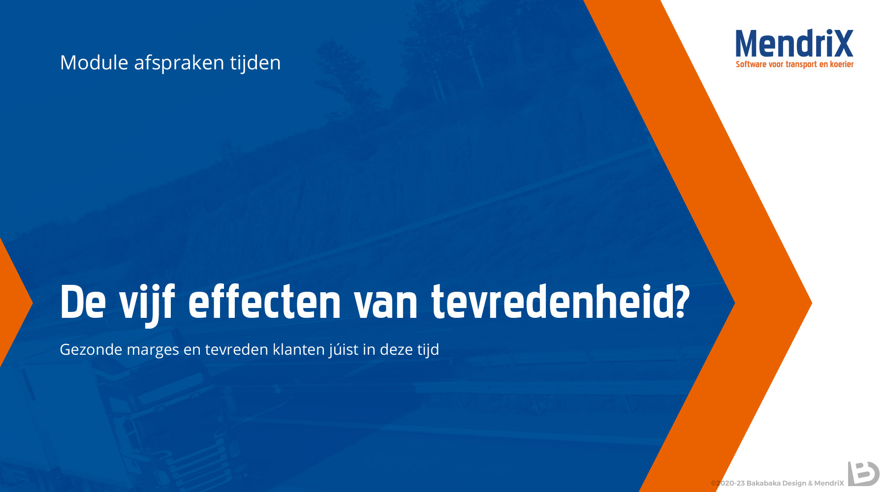
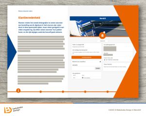
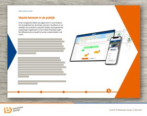
A whitepaper is a document that describes how a product solves a problem. I had to look up the term, when MendriX‘s Sjoukje asked me to create a digital whitepaper design for them. MendriX had developed a new module to add to their software service. It enables the easy planning of deliveries.
The digital whitepaper had to follow the MendriX brand style, and I was allowed to make it stand out graphically. I have been making designs for MendriX for over ten years, and I was intimately familiar with their branding. Even so, I discovered something new when designing this whitepaper.
Forward!
It took me all of those ten years to notice that there is an arrow shape in the MendriX logo. The ‘negative space’ of the capital X is an arrow to the right. Negative space is a designer’s term, it describes what remains of the background. You might know that FedEx’s logo has an intentional negative-space arrow.
I focused on MendriX’s own arrow in this design. The shape is front and centre, and challenges the reader to ‘turn’ the ‘page’, to proceed forwards through the document. As MendriX makes software to support logistics, ‘forward’ is a great vibe to have!
Sjoukje distributed the whitepaper as a pdf. This allowed us to include clickable links and saved us the costs of printing and delivering it.
Focus on your solution
Have you solved a problem, and do you need to tell the world? I’d love help you with a pdf whitepaper. Show me your brand and I’ll make an eye-catching document that fits into it seamlessly.
Need more examples? Have a look at my branding work, e-books, or promotion.


