‘A what are you going to build!?’ I asked Gerrit. ‘An eBay, but then for ships. No yachts, the big ones that transport freight and oil around the world,’ he answered. Gerrit asked me to help him with this large project, mainly for branding. So I got to make a logo for a ship trading platform.
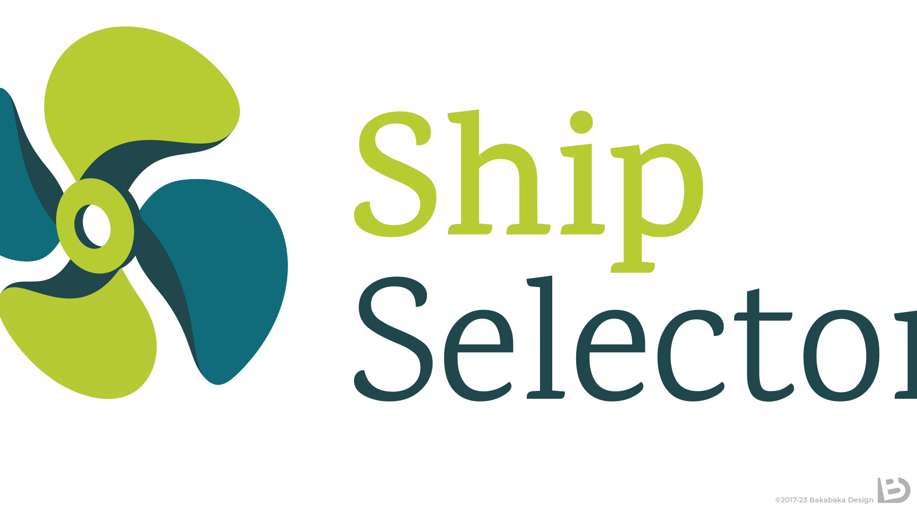
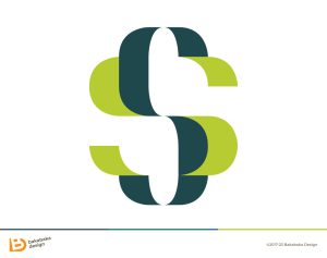
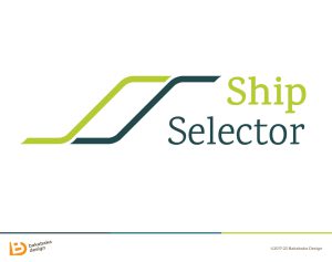
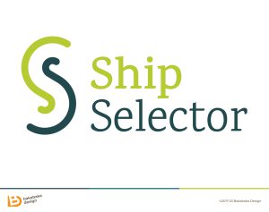
After some brainstorming, we settled for the name ShipSelector. With a bit of hesitation, for the SS initials could be sensitive. I did try a few logo concepts with these letters front and centre.
Colours of the sea
In the end, Gerrit was happiest with the logo with a propeller. Full speed ahead, very relatable. Usually, a ship’s propeller has three blades—I drew one with four. That way, the logo subtly includes two S shapes, referring to the brand name. Not everything in a logo needs to be on the nose.
We had way less problems finding a palette. A fresh lime green and two variants of a sea-blue. Those colours refer to the sea, and are calm and natural. The dark blues give it a businesslike feel, while the green draws attention.
Aye, aye, captain!
An online marketplace is not a small website. Because of that, Gerrit asked me to design a set of icons. Those are mainly visible when you log in to your account on the website. Funny detail: the ‘person’ icon wears a captain’s hat while you are logged in. Aye, aye!
Need your logo and icons to match?
Your logo and your website belong together. And your visitor needs to see that. I will design you a matching style. Suprise me with your plans and ideas. Being a ship broker is allowed, but not required!
Have a look at the other logos, icons, or brands in my portfolio for more inspiration.