
When finally get your Master’s degree, topping of your research with a thesis, it needs to look at least somewhat nice. That is at least what Elise thought. She researched the issues for young patients who transition from the Wilhelmina Child Hospital (WKZ) to the ‘adult’ UMC Utrecht. She wanted a nice book cover for her Master’s thesis. I helped her out.
In the first concepting, I tried to visualise the subject in different ways. I ended up offering Elise three sketches.
Between UMC and WKZ
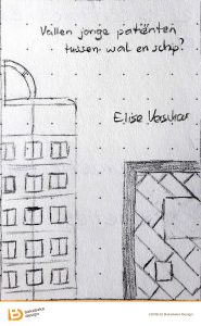
The first option displayed the buildings of both hospitals, with a gap between. This concept works, as both complexes have a very distinct architecture.
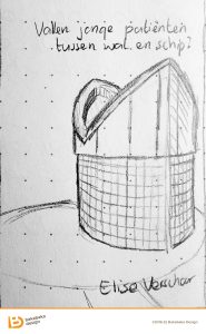
For the second option I went very literal: what exactly is between WKZ and UMC? A short ‘walk’ on Street View found me a small service building with a very distinct appearance. It’s apparently an emergency exit for the underground tunnel between the hospitals.
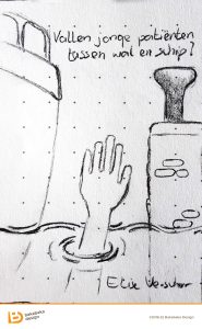
The last option was also very literal. In Dutch, there is an expression for getting lost in a transition; ending up with one foot in each of the phases and in general unable to commit to neither. The phrase translates as ‘falling in between quay and ship’. Elise used this expression in the thesis’s title.
She ended up choosing the third option.

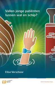
Some tracing in Adobe Illustrator, adding colour, and drawing a background later, and there was Elise’s cover! Okay, it was a bit more hassle than I’m suggesting here. But when it comes to concept and style, very little changed between the sketch Elise chose and the final product.
Don’t fall between quay and ship!
Do you want to attract some eyes with a nice book cover for your Master’s thesis? I’d love to make you one. If you can tell me what your research is about, I can find a fitting design.
If you want to know more about my design style, have a look at the other work in my portfolio.