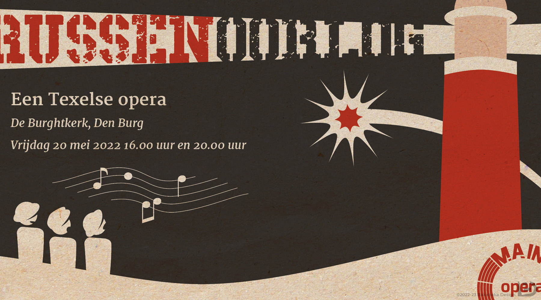
M.A. Intorno asked me to design a flyer for their opera ‘De Russenoorlog’, The Russians’ War. This performance tells the story of the uprising of some 800 Georgian prisoners-of-war, held on Texel by the German army.
History lesson incoming. In April of 1945, Texel, an island in the north of the Netherlands, is still occupied by the Germans. One night, the Georgian prisoners start an uprising. Hundreds of people die, until the Canadians clean up the situation a few weeks later.
Flare
That first night, April 6th at 1.00 am, a flare was shot over Den Burg, Texel’s largest settlement. This was the signal for the start of the uprising. It’s that moment that I tried to capture in my design. Den Burg’s very distinct lighthouse is a major element in the design.
I kept the colours as simple as possible: black, white and red. More history: when full colour print was still expensive, printers often applied two-colour print. They used only two inks, black and one other colour. That other colour was often red. Red catches the attention and stands out well.
It is this reason that I feel these three colours have a ‘classic print’ vibe. It harkens back to the middle of the 20th century. The damaged, stencilled font in the design reinforces this by giving the flyer a militaristic feel.
Sheep
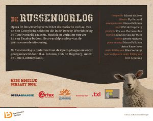
‘Oh yeah, er…’, Marco hesitated when he was briefing me for the flyer. ‘Could you add, uh, a sheep in the design?’
Say what? I had to confirm, but yes, he wanted an image of a sheep on a flyer for an opera. Apparently, the sheep are a recurring motif at Opera4daagse, the yearly opera event this performance was part of. I’m not one to ruin a good joke or reference, so that’s why there is a sheep staring you in the eye on the back of the flyer!
Joke in your design?
Do you have a reference or funny thing you want in your design? An in-joke? I’d love to hear about it! It doesn’t have to be a sheep, or a flare. Can you find other jokes and references in the other pieces of my portfolio?


