The right vibe, that’s what I’m always aiming for. A logo, a brand, should fit the client like a glove. Especially when it comes to style. It’s not easy to find that right away, and I stumble in this regard regularly. An example is the logo for Yoga Centre Oosterwold. For this assignment, I started off on the wrong track.
Petra Meirink wanted an original logo for her yoga centre. Her competitors use a lot of clichéd imagery, so she wanted to stand out by choosing something different. No lotus, no hamsas, no silhouettes of yoga poses. As a shape, she was very interested in the octagon. Eight is a central number in yoga, and the central room of the Centre has an octagonal shape.
Blunt feedback
My first concepts were very clinical. Sharp, geometrical and sleek. And thus, businesslike. Petra described them succinctly as ‘water supply company logos’. She missed the ‘flowing’ and ‘calming’ she wanted to project.
Petra’s feedback was harsh and blunt, but that’s honestly how I prefer my feedback. If it’s blunt but constructive, I know where I went wrong and what to improve.
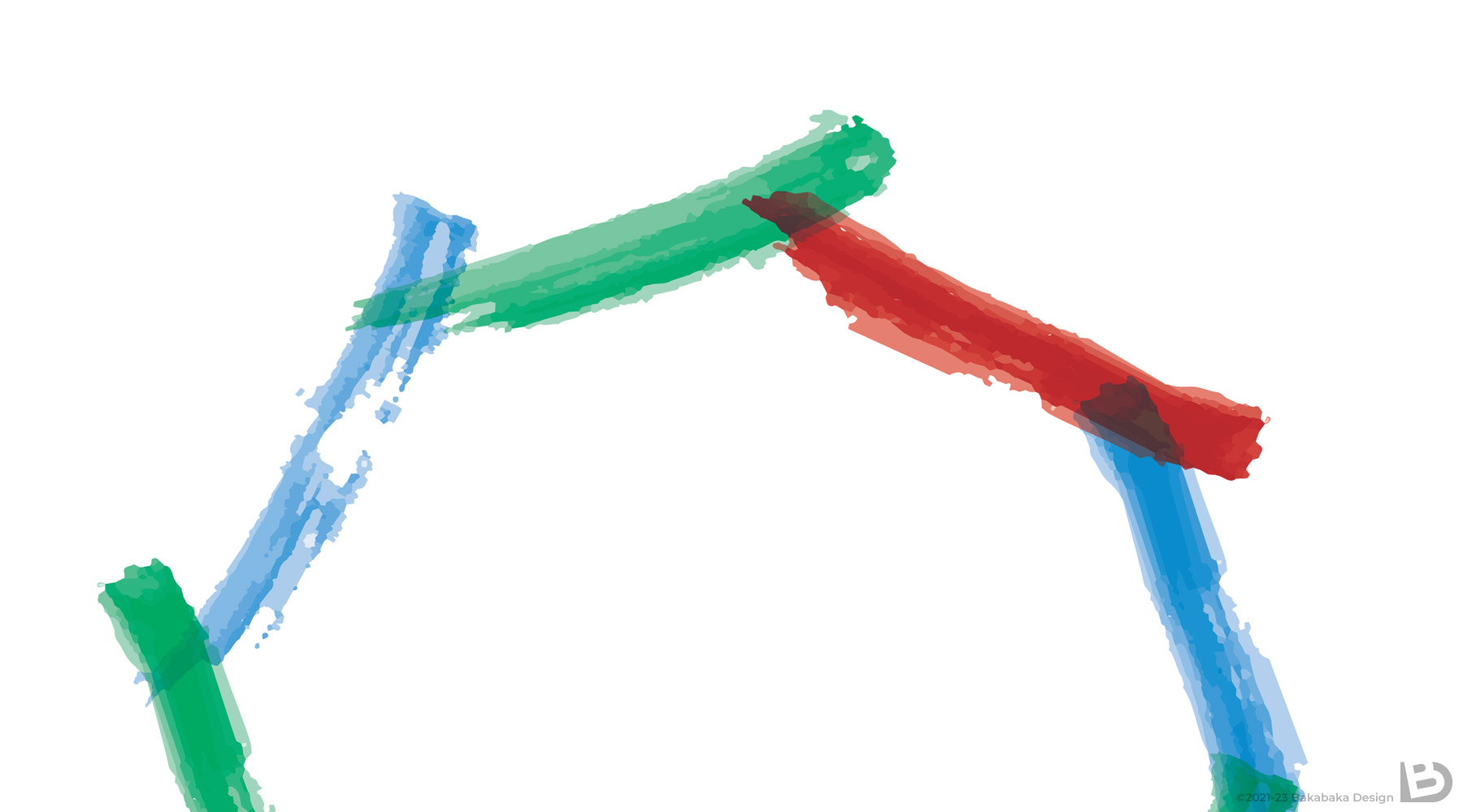
It helps that I’ve made multiple other designs for Petra before this logo. So I immediately realised what vibe she was aiming for. I took up painting. Not literally, but using some digital watercolour brushes, I was able to achieve a soothing and friendly effect. Bingo!
Red in a logo for a yoga centre?
Yes, red. Not the first colour you’d expect for ‘soothing’ and ‘calming’. However, Oosterwold also houses a school for aikido—and that sport’s central colour is red. The blue and sea-green stand for the yoga variant Petra focuses on: very much a flowing experience, with one pose smoothly transitioning into another.
In the end, Petra was unable to choose between the variants with red or blue-green text, so I simply delivered both.
‘Grateful for the outcome and the smart, to the point, synergetic way of working together.’
—Petra Merink-Chatah
Do you want a logo with the right vibe?
No matter the kind of company, non-profit, or one-person business you have, I’d love to help you. Tell me what vibe you want. And no problem if that’s close to what a water supply company would have. Let yourself be inspired by the other logos in my portfolio.