Frédérique is quite direct. Doesn’t mince her words. Very Dutch, but it makes matters clear with the least amount of hassle. She’s not afraid to antagonise with her candour. ‘Both sharp and blunt’, is how she phrases it herself. She is also quite the all-rounder. Copywriting, office management, getting things done. And this woman wanted me to make her a fitting logo. How does one make a logo for an office all-rounder like her?
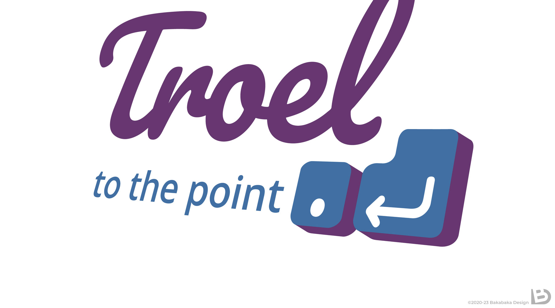
Frédérique has been using the word ‘Troel’ as a brand for years. ‘Troel’ is Dutch slang for an unsympathetic woman, a blunt and unpleasant personality. The term is related to the word ‘troll’. She reclaimed this word and wears it with pride. Yes, she can be unpleasant if need be.
Humour and puns
The logo’s main lettering is a classic handwriting. This refers to the actual ‘writing’, even though Frédérique does most of hers typing. I wanted to explicitly refer to that tool—the keyboard—as well.
Frédérique has a big sense of humour and loves puns. That’s why we decided together to make a visual pun in the logo: the images on the Enter and period keys visualise the pay-off ‘to the point’. I love getting some humour in my logos.
Personalised colours
Usually, a client leaves colour choice to me. I give them options and advice, and they pick what they like best. Frédérique had already done some colour research herself, and she knew she wanted to combine purple and blue. How exactly, she left to me.
No problem. I found a couple of hues that nicely fit her taste. I also gave suggestion for lighter and darker tints and shades. She can then use those for her website, or other aspects of her branding.
A logo fitting your personality
I aim to fit my work to my client’s personality. Do you want to give me a try? Tell me all about your personality, your rough edges, and I’ll start sketching!
Need some more ideas? Have a look at the other logos in my portfolio.