What is better than to meld your hobby with your work? If you’ve every been able to do work related to one of your pastimes, you’ll know what I mean. I myself have been playing bridge for quite a while, and I was happy to be asked to create a logo for the bridge app ‘bid72’.
Bid72 allows bridge players to practice bidding in an easy format. The creators asked me to apply my experience in the bridge field with my design skills.
How to stand out?
Finding a good logo concept within a particular industry can be very hard. Often, a branch is oversaturated with certain clichés and it’s hard to break free from those.
I suffered that for this design: lots of ideas for bridge logos focus on card shapes, or the four suit symbols: spades, hearts, diamonds, and clubs. Only late in the process did I dare to try something different: inside the box.
Recognisable shapes
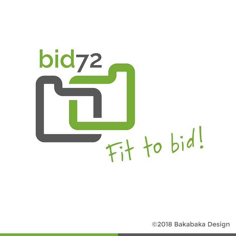
The box I mean is the bidding box. During club bridge, players use a box of bidding cards to relay their bids. This is to prevent players from cheating by using intonation to give more information that the actual bid. ‘Two… of, uh, diamonds‘, can mean something completely different than ‘Two diamonds!’.
Those bidding cards look a lot like small paper tabs. The one used for ‘pass’ is an almost square, green one. The highest possible bid, 7 no trump, is usually white with black text.
It’s these two shapes I combined into a logo. For a non-bridger they may not mean much, but every club bridger will recognise them.
Discovering a logo
I often get the impression that designing is only half creating, the other half is discovery. Discovering how shapes combine and interact. This is reinforced by the rigid logic I usually apply to the shapes in a logo. Restrictions breed creativity.
In this logo, the two shapes seem like letters: a and a d. Even better, when overlapping, the overlap created a kind of ‘i’. B, i, and ‘d’. Bid. What would fit better for a logo for a bridge app?
It’s discoveries like these that convince me that a concept is sound. This is why logo design is also a hobby I turned into work.
Shall we discover your logo?
I’d love to help you find the right concept for your subject, and discover shapes for it together. Let me know what you need, and I’ll start sketching. Have a look at the other logos in my portfolio to discover my style.