
Talking is so commonplace, you probably take it for granted. Aphasia patients cannot. They are unable to link their thoughts to the corresponding words. Aphasia is commonly a result of a stroke. Hubert helps aphasia patients, using an app: TouchSpeak. I made a logo for that app.
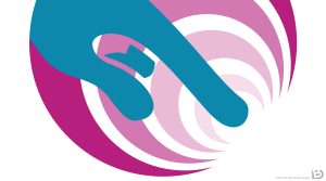
There was an existing logo for TouchSpeak, and Hubert asked me to retain the original idea: a hand, using its index finger to touch something, giving rise to a set of concentric ‘waves’. This communicates that the app relates to sound, and that the user can make an impact with it. Making waves, if you will.
Same concept, better execution? Can do.
Colour variants
The TouchSpeak app has multiple versions. Therefore, the logo has them too. The free version is green, the paid one gets the orange logo. The custom version is the most luxurious one and thus gets a purple colour. This version is aimed at healthcare institutions that want to tweak the app to their patients.
As usual, I included a greyscale version of the logo, as well as a white version for use on a dark background. You never know in what strange places and media your logo will appear, so these variants are always good to have.
Hubert wasn’t done yet! There are extensions to the app called ‘TypeSpeak’ and ‘TextSpeak’. We adapted the logo to these, one with yet another colour.
Do you need a logo for your app?
Did you create an app, and now you’re finding yourself in need of a good icon or logo for it? I can help. No need to ask for five variants right off the bat, one is more than enough. Tell me about your app and I’ll listen.
If you want to get a better idea about my style, have a look at the other logos I made.