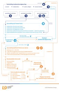
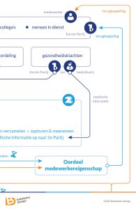
Business processes can get complicated. Especially when multiple separate companies are involved. Illustrating such a process is hard, but also very rewarding. A good figure or visualisation clarifies the process for everyone. Even, or especially, for the people who are part of it. That certainly happened for this flowchart / infographic I made for one business process.
Fair warning: all data and processes have been mostly anonymised. The companies involved prefer to keep things under wraps. I can’t even elaborate on what kind of process this is!
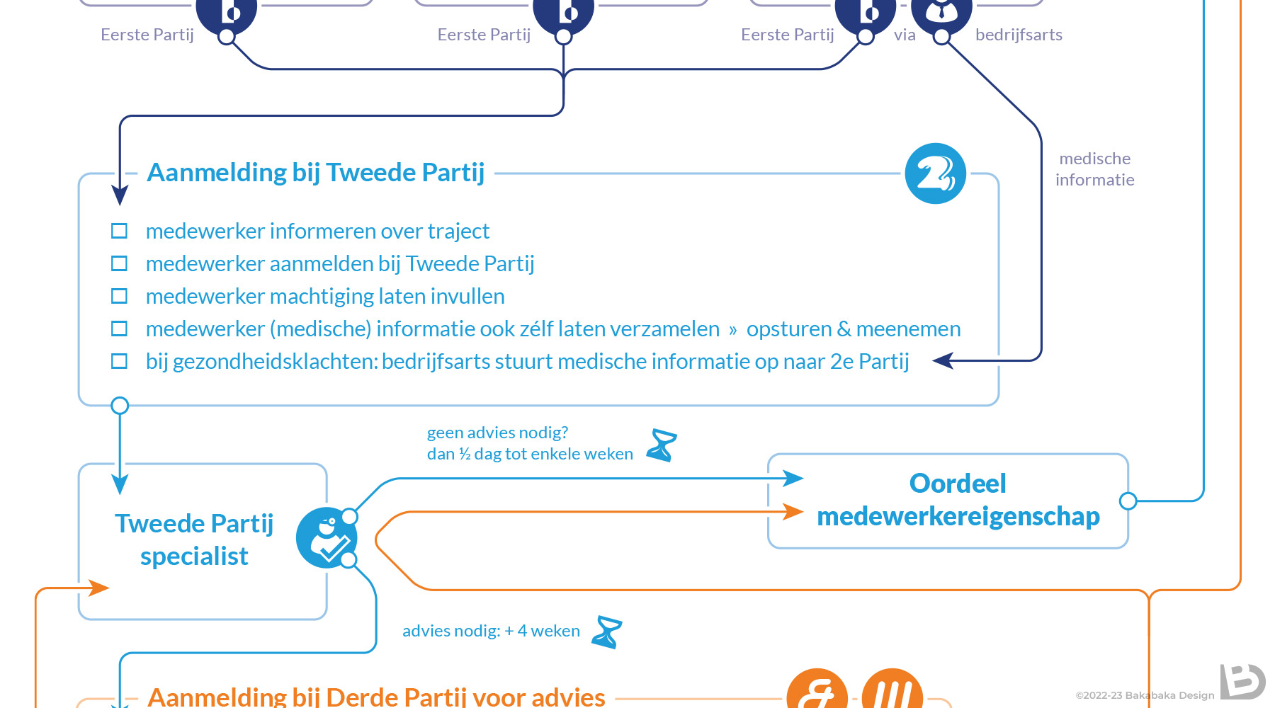
Spaghetti
When designing an infographic for a business process, I have to apply a lot of skills. Colour, typography, and composition are all vital. They need to work together to keep the process clear. Especially flowcharts like this one run the risk of clutter: everything reading as a jumbled plate of spaghetti. Overview is king!
Fortunately, for this course I worked with a very practical and pragmatic representative of the involved companies. I’ve worked with her before, and it’s a joy doing so. She isn’t afraid to take necessary decisions when the companies are slow to do so.
Insight
She also came with some very nice feedback a few weeks after the project: the flowchart had worked really well. Even people who had been involved in the process for years had gotten some insight from my diagram. This helped them understand the process even better.
That’s exactly what you want to hear, right!?
Do you need an infographic for a business process?
I’d love to help you provide insight in your processes, and clarify them. Prepare for a lot of questions, though! That way, we can prevent the spaghetti scenario.
You can get an idea of my style in the rest of my portfolio, or: