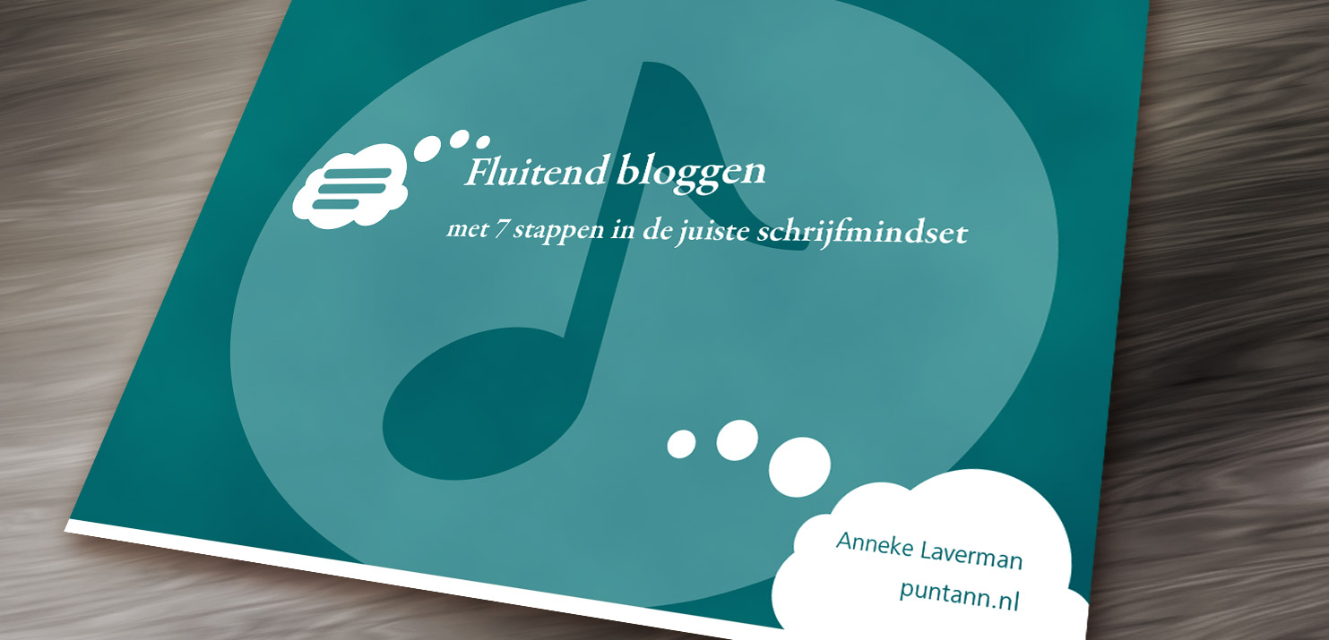
Do you know that feeling of dread when you have to write a social media post or blog? No idea where to start, how to tell a story? You’d love to publish regularly but the actual writing… ew. Anneke Laverman, also known as Puntann, wrote an e-book that helps you get over that dread: ‘Fluitend Bloggen’ (literally, ‘Blog while whistling’). I did the graphic design for her: e-book design for bloggers.
E-book design for bloggers
Anneke and I have quite some experience in collaborating. We know each other rather well. I feel comfortable making daring proposals, and she is comfortable giving direct feedback. Sometimes we can be blunt, but that’s a way of communication I don’t mind at all.


The process for this e-book design wasn’t any different. Anneke really liked my idea to use large icons. She just didn’t expect how big I’d make them: large enough to sit behind the text. We had some healthy butting of heads and I’d say we achieved a great final product.
Icon design
The icons still have a prominent place. I love icons! Displaying a concept with a simple image is a great challenge.
I usually start brainstorming and doing simple sketching with pencil on paper. For each icon, I can freely try. It doesn’t need to be perfect or even pretty, this is just exploration. No, my sketchbook is not nearly as ordered as a typical designer makes you believe their is.
The good concepts get scanned and I put them into Adobe Illustrator to refine. When do those pop up, you ask? Well, sometimes it’s sketch number three, sometimes twenty-three. Holes in one are rare!
It’s only when the small details are correct that I’m content. Those are vital, and that’s why I spend a lot of time on them. Examples of details are the distance between shapes, or nicely flowing curves. Objects that are seemingly symmetrical should actually be. I can get lost in details like that.
Blog while whistling!
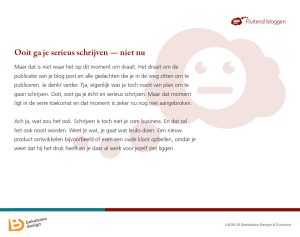
Anneke was right when I had put too much focus on the icons in the e-book design. I counteracted by giving the text a large line height and lots of white space. This causes each page to have a small amount of text, drawing your attention to the text that is there. The page composition becomes light and accessible this way. Lots of attention to the text, icons secondary.
And the contents? I can only gush. To write this article, I browsed through the e-book again, and it works! Anneke uses an upbeat and casual style how you will be blogging and whistling at the same time. She gets you mind set to writing is seven steps. Blogging isn’t dreadful at all!
If you’re curious and you can read Dutch, have a look at the entire e-book at Anneke’s website.
Need your e-book designed?
Do you have an idea for a good e-book? Let me help you with the graphical design. Who knows, we could come up with some nice icons to reinforce your message. Tell me what you need.
If you want to see more of my work, have a look at the rest of my portfolio.